Thursday, 8 December 2016

Contents Page Deconstruction 2


Image result for music magazine contents page

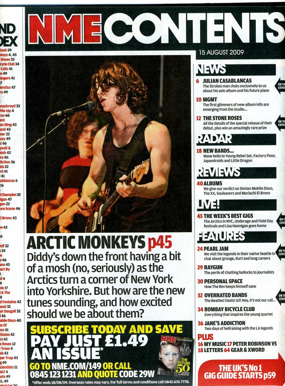
The Masthead text is 'NME' followed by 'contents' showing that instantly the audience know what page this is, also the colour of NME is bright red on a black background these two colours contrasting very well, as it forces the NME to stand out. Secondly contents is a bold white font which correlates well with the black background. 
On the right hand side there are other additional headings that stand out the headings are in bold white text with black backgrounds, with a slight piece of additional text/information regarding the heading title. Example being the 'LIVE!' heading as this has additional texted that is relating to bands and gigs that are soon or have recently just happened. The main image is a photograph of 'Alex Turner' he is the lead singer in the band Arctic monkeys. This could connote that people who are big fans of the band or a fan of  Alex Turner would most probably be interested in purchasing the magazine. As Alex Turner is in the foreground of the image this would connote that he is seen to be as the most important person in the band from the audiences perspective making the magazine sell better.
The bottom right hand corner advertises the magazine and the starting prices, this is semi-eye catching due to the colour scheme that is used with it being a red background with white text in the foreground. The author is clever with this as he uses his own magazine to advertise it, using a very small but effective text taking up a very small area of the page.
The colour scheme text is preferably black however it varies, the background is white which contrasts well with other colours. A brief paragraph explaining news that concerns the arctic monkeys, this connotes that the audience would read this small passage quickly whether it is negative or positive as they wish to know the news regarding the band as soon as possible. Often this little passage of text can be rumours or made up content. Also i has a rhetorical question that big fans would straight away answer with a yes, 'How excited should we be about them'.

Media Codes And Conventions Of A Double Page Spread.

Double Page Spread Codes And Conventions

Regularly used codes and conventions with double page spreads.

A Large Image- image used as a source of direct address, which is supposed to entice the target audience, usually a celebrity is used as the image for eye catching, Giving the audience encouragement to buy the magazine and enjoy it.

A Quote- Usually a quote that has been said by the person or people that are presented in the large image used. Text will be used to break up the image and the the quote however in some magazines quotes overlap the image, Quotes usually used are powerful and gripping to the reader, sometimes often controversial or opinionated.

Names- Often a large bold font is used someone of the page which tells the audience who the character or model in the image is.

Brief introduction- Often a short paragraph that introduces the double page spread and who the key person or theme it involves.

The Text- text that is sized 11 pt. and is usually a default font like Ariel or times. Text usually consists of three to four columns, making it seem tidy and structured well, also text is use with magazine titles names and dates throughout the pages.

Other Images- The main image (large image) is usually positioned on the left hand side of the double page spread however its not uncommon for the author to disobey this rule. Most other images are placed on the separate page of the text or the text use is placed around the images used.

Colour Scheme- The majority of the time a double page spread follows the same colour contrasts as the rest of the magazine, simple colour schemes are preferably a better option because then reader or audience isn't focusing on the colours as they should be focusing on the text and images.

Contents Page Deconstruction

Contents Page Deconstruction.


Image result for q magazine contents page
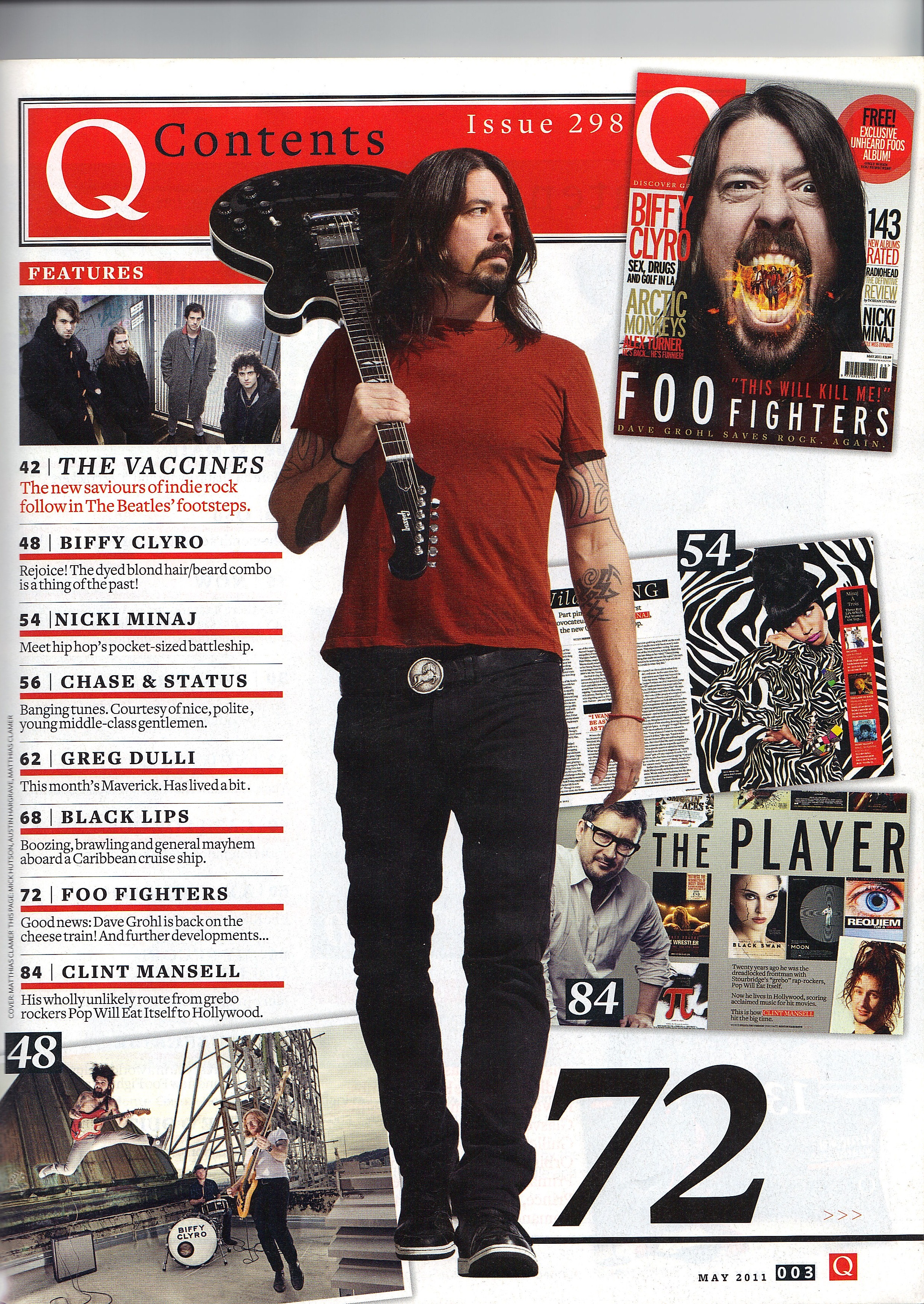
The masthead of this magazine is called 'Q' The Q magazine Magazine logo stands out and is eye catching because of the colour contrast that 'Q' use this being red background with a large white 'Q' also with it being at the top left of the page forces it to stand out. Toward the left there are different categories for the magazine which includes a large variety and would therefore have an impact on a larger target audience. These are used to help the audience detect which piece of the magazine they wish to view.
This is a simple style and format of contents page which makes its easier for the reader to understand where things are and give the idea of whats happening. The large image used is an image of Dave Grohl who is also holding his musical instrument (guitar), he is the lead singer and main attraction of the band 'The Foo Fighters' this would create an impact on any reader if they are a large fan of the band or of Dave Grohl himself or who enjoy there music. Overall the colour scheme is very simple but effective as there isn't too much going on which causes less confusion and an easier understanding of whats actually happening on the page. Also with the background being very plain this actually creates a big impact as everything is therefore read able, keeping the reader focused on everything else such as the images and other categories.

Due there being other names of bands and artists along the left hand side this gives a wider range of different genres for audience and what the audience will find in the magazine. There is a small image of the front over in the top right hand side of the contents page this is to show possible similarities between the two.

Thursday, 24 November 2016

Second Music Magazine Analysis


Image result for q magazine

My second magazine I have chosen to deconstruct is created by a different organisation and institution as opposed to my first deconstruction. It is created by the brand 'Q' who are a company who specify their products in the united kingdom, however sometimes there products are sold to Americans and can be sold worldwide.
The first thing  the audience will witness is the large image used is a photograph of 'Ed Sheeran' who many people look up to as their favourite pop artist, due to the many amount of number one hits that he has succeeded in. This therefor having a large impact on who the target audience is, in this case the target audience would be a wide variety, ranging from young teenagers to adults (ages 13-40) of both genders however additionally more so to female viewers as they tend to idolise Ed Sheeran.
The masthead for these magazines are the large 'Q' with an additionally quote in this case the quite being 'The stories of the year' which is written in a large font, nearing the top of the page in a bold, using standard 'Arial' font type, The masthead is behind the main image however is still visible as easily readable/understandable this was put in place because the model is looking in the direction of the title which could have an impact in where the audience second guesses where they view next. The background of the large 'Q' is bright red which contrasts well with the white 'Q' this could perhaps give the brand a larger audience as this is eye catching and would make them a more well known brand.
Standard colour contrasts occurs, meaning that not too many colours are involved however this is a positive factor as lots of black and white occurs which creates standout and eye catching pieces on the cover when the red block writing appears, as red contrasts well with a white or black background/foreground.
Listed toward the right hand side in bold white text, are the names and a brief piece of luring information of other musical artists who may be included in the rest of the magazine. However only the names of the artists appear bold as that is the most important factor, leaving room for numerous other options for the author to include. The reason that this would occur is because even with small adjustments such as this, it would connote that the reader could purchase this magazine because they have seen that information on one of the additional artists in this case: Wilko johnson, Pink floyd, Casabian,  or Culture club, this would therefore give a wider range of ages as some of the artists are older as is their targeted audience.
The image of 'Ed Sheeran' shows that he is dressed casually but in a smart manner and that he is latching or grappling ahold of his guitar, this connoting that he may feel that the guitar is a requirement for him to produce his work, as he is passionate about it.

Overall i would say that this magazine is very successful, and it could appeal to people of most ages and toward both genders, also with it being branded and created by the institution 'Q' would have an impact as they release a new musical magazine each month, some people would buy it for that reason alone because its something that they do regularly or at least every month.

Music Magazine Analysis


Image result for nme music magazine rihanna
NME is the magazine I will deconstruct. Firstly it stars Rihanna as the cover image because she is a famous musical artist, this being the reason why i chose this magazine in particular. Also it fits to the genre of the magazine I am going to do. Furthermore NME is a popular music magazine that is published in the UK and has a high seller of the magazine.


The magazine has a pop singer that is focusing and looking directly toward camera. It is a medium shot, showing her head, arms and waist. It looks like she is standing up but this is something i am unsure of as we can not see her legs. The image/picture of 'Rihanna' covers the entirety of the magazine. On top of the image of the magazine there is the the masthead which in text says NME which is in-front her head, at the direct top of the page. Nearing her shoulder, there is a cover-line in black bold font. The image of Rihanna's name is in the mid centre of the magazine and is created using a bright pink font. As a bar-code is used in the bottom right this shows that the magazine is professional and would be used for legitimate sales.


NME’s masthead is very feminine and attractive, the bright pink outlines that the image is a pop singer. The font used is a ‘arial’ and is a bold text. The letters NME represent ‘New Musical Express’ which show non- conformity and comes from a musical background (American/British culture).
NME  has a wide range of genre/music styles so we could associate it with NME New Musical Express, as NME have previously used other genres such as rock. NME is clearly showing that it is aimed for all different types of music genres.
The lighting looks high key, and is used to make her facial expressions more clear. Creating an impact on the target audience. There is no setting as it just consists of white screen so probably the photograph was taken in a studio. This connotes a bigger image for the audience, as there is no background to focus on, and 'Rihanna' is the main centre of attention.
The tag line relates to ‘Rihanna’ with the quote being ‘the state of music today’ this is making a reference to ‘Rihanna’ and the other singers that are going to be in the rest of the magazine. Also the colors of the tagline are once again in bright pink  to emphasise that it is the key tagline on the front cover.
The cover image is a well known American singer ‘Rihanna’ who is a pop/r&b artist which has a big influence on the targeted audience.

Composition: Her pose is very feminine as she is leaning on her hips which could connote that she wants attention or she is attractive. Also her clothing is modern and it looks like she has her own style. This would also perhaps play a part in influencing males to buy this magazine (the male gaze is targeted). Her clothing is modern with a black different style top with blue shorts, which this could associate with her style of music.

lastly the target audience is quite clear as it is aimed at teenagers /adults age between 14-25. Male and female however I believe more toward the female view. And just people into pop/r&b music in general for this front cover magazine because the singer ‘Rihanna’ is a pop singer.

Overall i believe that this magazine cover is successful as key conventions are used and it is perfect for the desired target audience. With it having correct text's, photography and colour scheme.

Tuesday, 22 November 2016

Music Genres

Music Genres

The different types of music genres are differentiated between two categories, this being Indie music and mainstream.

Indie Category:
 Produced independently (no institution or a very small one) isn't advertised as much as mainstream and is followed less by the public in general, less popular of the two.


Mainstream Category: Usually considered the more popular styles of music, most music often originates form mainstream musics. include large institutions and also bands/groups.


Some examples of genres of which are included in the indie category.


  • Electronic- Employs electrical musical instruments
  • Punk- Is a rock music genre that developed and is slightly more improvised /varied.
    Trap- A different type of rap involving mostly southern rappers.
  • Country- It is a mixture of ballads and dance tunes played with acoustic instruments.
  • Glitch hop style- A mixture of hip hop and electronic music.
  • Reggae- Originated in Jamaica, combining elements of calypso and rhythm and blues consists of a strongly accentuated offbeat. 
  • Grime- Is considered as London rap, however in later days its reaching its peak and could be considered in the mainstream category.

Some examples of genres of which are included in the Mainstream category.


  • Rock- a form of popular music which evolved from rock and roll and pop. 
  • Grime- Again grime could be considered to be in both types of music styles (definition above).
  • Pop- The most popular commercial music.
  • Rap- Consists of a recurring beat patterned in the background and counterpoint for rapid, slangy, and often boastful rhyming lyrics. 
  • R&B- Also known as rhythm and blues.

Typical audience examples:

  • Rock- 16-30 years old, mixed genders, spiky hair middle class.
  • Grime- 14-25 years old, male, chavs, black ethnicity, lower/middle class.
  • Pop- 5 years plus, mainly females, mainstream, white. all social classes.
  • Rap- 14-30, mainly males, free style, lower/middle class.
  • R&b- 13-25 years, mixed genders, all classes, specifically middle class.


Sub genres are smaller genres that are attached to the larger main genres


Genres and sub-genre:

Example one: Electronic music
Sub genre- House music, glitch hip hop.

Example two: Rap

Sub genre- Grime, Trap.