Thursday, 8 December 2016

Contents Page Deconstruction 2


Image result for music magazine contents page

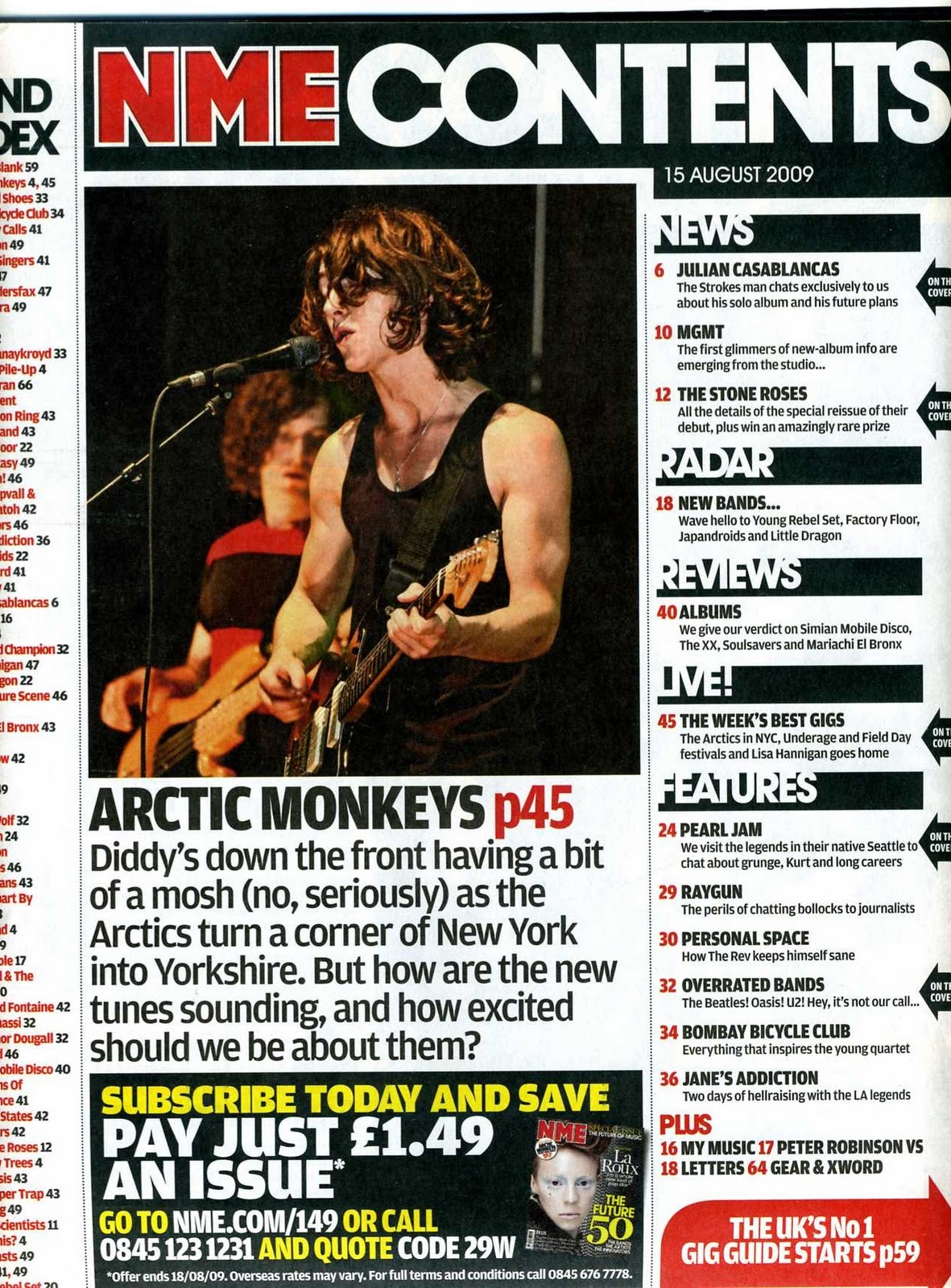
The Masthead text is 'NME' followed by 'contents' showing that instantly the audience know what page this is, also the colour of NME is bright red on a black background these two colours contrasting very well, as it forces the NME to stand out. Secondly contents is a bold white font which correlates well with the black background. 
On the right hand side there are other additional headings that stand out the headings are in bold white text with black backgrounds, with a slight piece of additional text/information regarding the heading title. Example being the 'LIVE!' heading as this has additional texted that is relating to bands and gigs that are soon or have recently just happened. The main image is a photograph of 'Alex Turner' he is the lead singer in the band Arctic monkeys. This could connote that people who are big fans of the band or a fan of  Alex Turner would most probably be interested in purchasing the magazine. As Alex Turner is in the foreground of the image this would connote that he is seen to be as the most important person in the band from the audiences perspective making the magazine sell better.
The bottom right hand corner advertises the magazine and the starting prices, this is semi-eye catching due to the colour scheme that is used with it being a red background with white text in the foreground. The author is clever with this as he uses his own magazine to advertise it, using a very small but effective text taking up a very small area of the page.
The colour scheme text is preferably black however it varies, the background is white which contrasts well with other colours. A brief paragraph explaining news that concerns the arctic monkeys, this connotes that the audience would read this small passage quickly whether it is negative or positive as they wish to know the news regarding the band as soon as possible. Often this little passage of text can be rumours or made up content. Also i has a rhetorical question that big fans would straight away answer with a yes, 'How excited should we be about them'.

Media Codes And Conventions Of A Double Page Spread.

Double Page Spread Codes And Conventions

Regularly used codes and conventions with double page spreads.

A Large Image- image used as a source of direct address, which is supposed to entice the target audience, usually a celebrity is used as the image for eye catching, Giving the audience encouragement to buy the magazine and enjoy it.

A Quote- Usually a quote that has been said by the person or people that are presented in the large image used. Text will be used to break up the image and the the quote however in some magazines quotes overlap the image, Quotes usually used are powerful and gripping to the reader, sometimes often controversial or opinionated.

Names- Often a large bold font is used someone of the page which tells the audience who the character or model in the image is.

Brief introduction- Often a short paragraph that introduces the double page spread and who the key person or theme it involves.

The Text- text that is sized 11 pt. and is usually a default font like Ariel or times. Text usually consists of three to four columns, making it seem tidy and structured well, also text is use with magazine titles names and dates throughout the pages.

Other Images- The main image (large image) is usually positioned on the left hand side of the double page spread however its not uncommon for the author to disobey this rule. Most other images are placed on the separate page of the text or the text use is placed around the images used.

Colour Scheme- The majority of the time a double page spread follows the same colour contrasts as the rest of the magazine, simple colour schemes are preferably a better option because then reader or audience isn't focusing on the colours as they should be focusing on the text and images.

Contents Page Deconstruction

Contents Page Deconstruction.


Image result for q magazine contents page
The masthead of this magazine is called 'Q' The Q magazine Magazine logo stands out and is eye catching because of the colour contrast that 'Q' use this being red background with a large white 'Q' also with it being at the top left of the page forces it to stand out. Toward the left there are different categories for the magazine which includes a large variety and would therefore have an impact on a larger target audience. These are used to help the audience detect which piece of the magazine they wish to view.
This is a simple style and format of contents page which makes its easier for the reader to understand where things are and give the idea of whats happening. The large image used is an image of Dave Grohl who is also holding his musical instrument (guitar), he is the lead singer and main attraction of the band 'The Foo Fighters' this would create an impact on any reader if they are a large fan of the band or of Dave Grohl himself or who enjoy there music. Overall the colour scheme is very simple but effective as there isn't too much going on which causes less confusion and an easier understanding of whats actually happening on the page. Also with the background being very plain this actually creates a big impact as everything is therefore read able, keeping the reader focused on everything else such as the images and other categories.

Due there being other names of bands and artists along the left hand side this gives a wider range of different genres for audience and what the audience will find in the magazine. There is a small image of the front over in the top right hand side of the contents page this is to show possible similarities between the two.